Looking back at the best throwback college football helmets was so popular that we took our expertise to the NFL. Obviously, growing up in the early '90s with Tecmo Super Bowl, we are extremely biased toward designs of that era.
Take a look and let us know what you think:
T-5. NY Jets
Skinny: This looks like a 3rd grader's doddle - we like it already.
T-5. New England Patriots
Skinny: Very childish like the Jets' old dome. We love this helmet painting football as America's true past time, "a game Revolutionary War soldiers played during downtime." Almost as absurd a connection as the Miami Dolphins' logo.
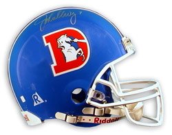
4. Denver Broncos
Skinny: Some might say these are outdated, we say a big orange "D" donned by the likes of John Elway, Steve Atwater, Karl Mecklenburg and Tom Jackson are evergreen. The orange jerseys really accentuated these.
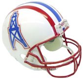
3. Houston Oilers
Skinny: This is how we picture the creation of the Oilers' look:
Owner: "First, we need team colors. Work with me here - what do you associate with oil?"
Designer: "Death, destruction, global warming, acid rain, pollution, greed, corruption...."
Owner: "Hmmm.... I got it: red and baby blue."
Designer: "I hate you."
2. Denver Broncos
Skinny: Most NFL helmets are quite boring. This older Broncos' helmet, on the other hand, completely flies in the face of convention: the horse is just wilin' out. Look at this thing: it's already pulled a Smarty Jones and broken its neck, jaw and both front legs.
1. Tampa Bay Buccaneers
Skinny: Using a ridonkulous red & orange color scheme, the Bucs got the shit knocked out of them for 20 years in these puppies. Real.
4.20.2006
"Don't Call It a Comeback": Part 2
Posted by
The Realests
at
10:29 PM
![]()
Subscribe to:
Post Comments (Atom)

No comments:
Post a Comment